I’m not sure if I talked about it on the blog, but last summer I decided to really start putting in the effort to learn Copperplate calligraphy. I have long been interested in calligraphy, going back to high school. I’d purchase those markers with the angled nibs and my writing would look OK, but it was never quite what I wanted.
When my dad was young, he also had an interested in calligraphy — but the gothic and illustrated letter styles. Here’s an example of his work:
Gorgeous, right? But what I fell in love with was elegant, flowing, feminine script. I thought I wanted to try my hand at the Modern Calligrapahy style. You are all familar with it, I’m sure — it’s really popular right now. But I found that I just couldn’t relax my hand enough. Instead of looking casual, my letters looked forced and awkward.
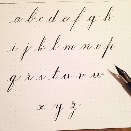
After months of browsing the Internet, looking at handlettering examples, I finally found what I was looking for: Copperplate (also called Roundhand or Engrosser’s Script). It’s very old-fashioned looking, and there are specific ways to form the letters. In a way, it’s really more like drawing letters, not writing them.
I found that Instagram has a fantastic and supportive community of calligraphers! And just about the time I was really to give it my all, there was a Handlettered ABC challenge starting up. Every day was dedicated to one letter, in whatever style you like. Perfect! It was a great way to get excited about script.
Flash forward to the fall. With school starting and all the kids activities, I just couldn’t get it together and my lettering practice fell by the wayside. So one of my goals for 2016 is to work on improving my skills and hopefully be able to address next year’s Christmas cards in Copperplate script. Well, wouldn’t you know it — a reboot of the Handwriting ABCs challenge started as well! So this time I thought I’d start sharing my journey in learning this amazing style of handwriting. I have so much to learn, and so much to improve on, but you know what? I have been keeping all of my practice sheets in a binder and seeing how much I have already improved encourages me to keep going.
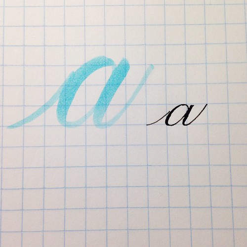
So here are the letters from week 1! First up, obviously, is A. I wrote two examples — the first is brush calligraphy using a Zig Millenium brush marker (from my scrapbooking days about 12 years ago!), and the second is Copperplate.

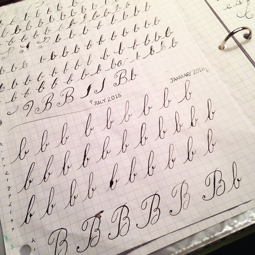
For the letter B I pulled out one of my sheets from the last challenge in July to compare and contrast.

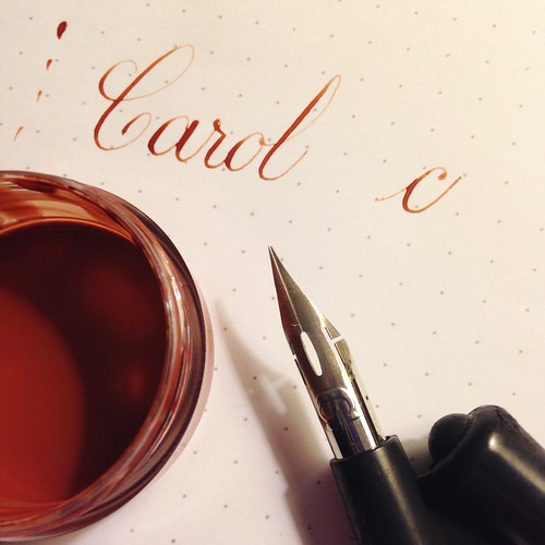
C gives me trouble. I never think the majiscule (capital) looks right.

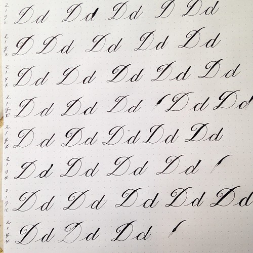
D is also a challenge. The majiscule is one stroke. I need a lot of work here.

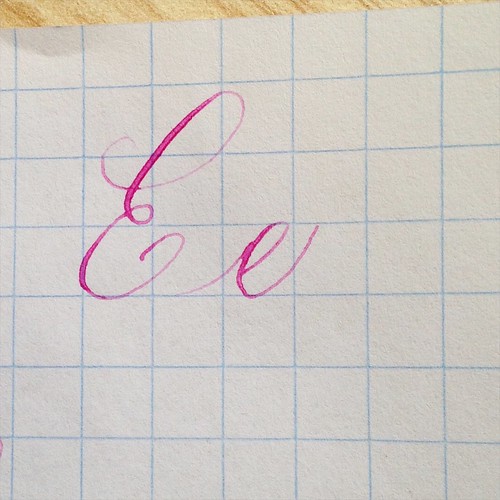
E is fun and loopy.

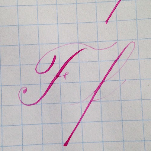
F can be tough, but it’s so fun to write out that I don’t mind doing it over and over.

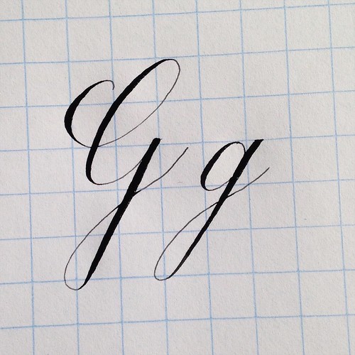
And that brings us to today’s letter: G. I was really happy with this example, even if the lowercase isn’t quite right. The descending loop is cutting into the oval. But I was just so darn proud of that squared off top that I used it anyway!

I think one of the reasons I just love this style is because it forces you to slow down. If you zip through the strokes, you’re going to get messy, inconsistent letters. You have to take your time and really pay attention to what you’re doing.
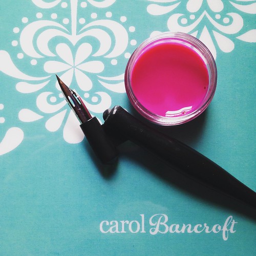
If you’re interested in getting started, I highly recommend following @anintran and @masgrimes on both Instagram and Periscope. I have learned so much from them! Next week I’ll put up another post with some of my favorite resources, including the tools that I personally use. The greatest thing about calligraphy is that anyone can do it! It’s all about practice! Trust me, if I can do it, so can you!

